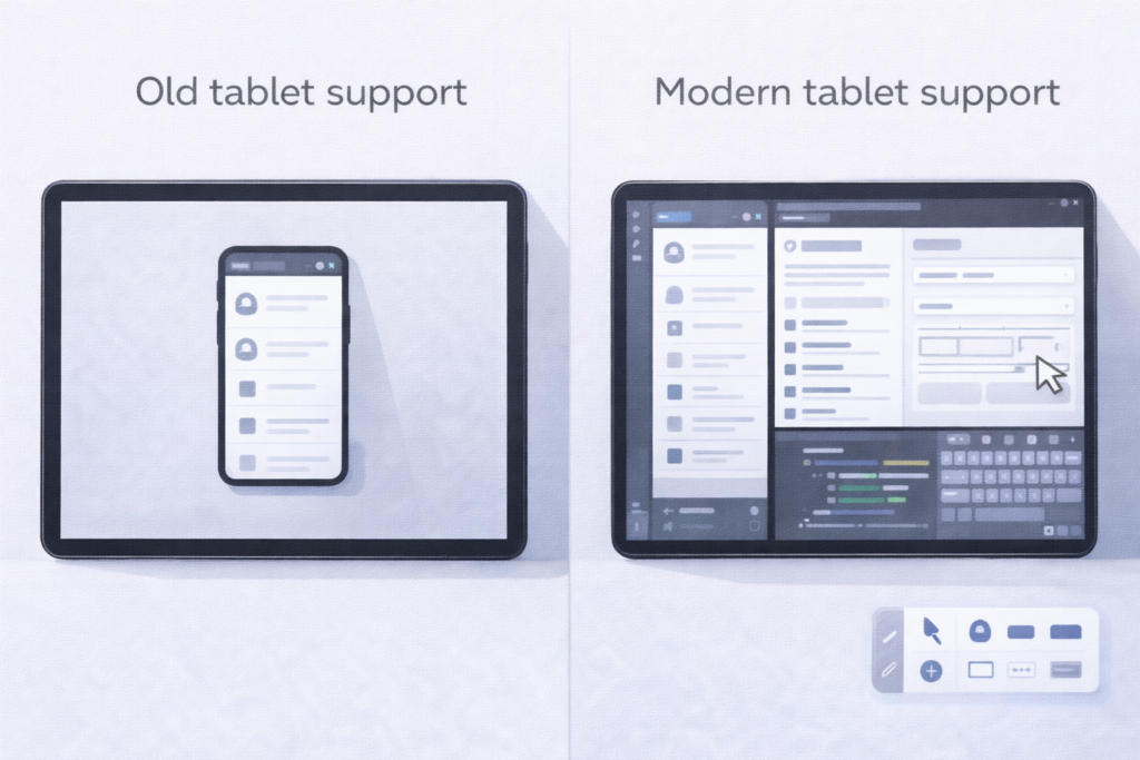
For years, “tablet support” in Android circles had a narrow, almost forgiving definition: the app doesn’t look too blown up on a bigger screen. Maybe it runs in landscape. Maybe there’s a two-pane layout if a product team was feeling ambitious. If it didn’t crash, it counted.
Google’s latest large-screen messaging shifts that definition in a more consequential direction. Tablet support is no longer a special layout for a special device category—it’s a baseline expectation that an Android app behaves well across variable windows, multiple concurrent apps, and multiple input types, including scenarios that look increasingly desktop-like.
You can see the new bar most clearly in Google’s Large screen app quality guidelines, which don’t treat “tablet” as a one-off target. Instead, they define a ladder of readiness for tablets, foldables, and ChromeOS devices, with “support” meaning: the app fills whatever window it’s given, survives resizing, and remains fully usable when the user is multitasking.
A new baseline: “runs properly in any window”
The quiet redefinition starts with Tier 3—“Large screen ready”—which reads less like a stretch goal and more like a compatibility promise users now assume. Google’s definition includes:
- running full screen in both orientations and full window in multi-window
- avoiding letterboxing and “compatibility mode” behavior
- retaining state through configuration changes like rotation, resize, and fold/unfold
- basic support for keyboard, mouse, trackpad, and stylus
- support for multi-resume, where your app may need to keep updating even when it’s not the focused window
- graceful handling of exclusive resources (camera, etc.) in a world where another app may be active beside yours
That’s a different framing than “it has a tablet UI.” It’s “your app is a good citizen in a system where the user controls the window.”
Google reinforces this shift in public-facing messaging. At Google I/O 2024, the blog explicitly defines “adaptive apps” as apps that adjust based on window size changes, device posture, and even font size—conditions that show up constantly once you accept resizable windows and foldables as normal.
Tablet support now includes desktop-like multitasking
The change becomes harder to ignore once you factor in Android’s push toward more PC-style workflows on tablets. In the 2024 developer preview of desktop windowing on Android tablets, Google calls out the need for “adaptive layouts,” “more robust multitasking,” and “adaptive inputs” so apps work across the large-screen ecosystem (including environments where apps run in freeform windows).
That matters because freeform windowing turns every brittle UI assumption into a bug:
- hard-coded aspect ratios break
- portrait-only flows look awkward in a narrow landscape window
- “this screen will always have space for a bottom sheet” stops being true
- lifecycle and state handling get tested continuously by resize and focus changes
Google’s large-screen guidance is effectively a warning: the OS is moving toward more window variability, so “tablet support” must mean “window support.”
From “big phone UI” to adaptive navigation and input
Beyond baseline readiness, Google’s higher tiers make the expectations explicit.
Tier 2 (“Large screen optimized”) calls for layout optimizations across configurations plus enhanced external input support. Tier 1 (“Large screen differentiated”) goes further: multitasking that feels intentional, foldable postures, drag-and-drop, stylus integration—features that treat large screens as their own interaction environment rather than a stretched phone.
This is where the implications for existing apps get real. Many apps “support tablets” in the old sense—layouts scale, nothing crashes—but still fail the newer definition in everyday use:
- Navigation that doesn’t reflow. A bottom navigation bar that works on phones can become a reach-and-clutter problem on tablets; Google’s own guidance nudges developers toward patterns like vertical navigation on large screens and list-detail layouts.
- State that’s fragile under resize. If a resize recreates activities/fragments without robust state restoration, users lose their place—especially painful in commerce, productivity, and media flows.
- Input that’s treated as optional. Keyboard focus, pointer hover affordances, trackpad scrolling behavior, stylus interactions—these aren’t “power user extras” on large screens. They’re part of the platform’s expectation of readiness.
- Multi-window resource conflicts. Google has repeatedly stressed not assuming exclusive access to hardware like the camera because large screens are commonly used side-by-side with other apps.
What developers may need to revisit
The practical takeaway isn’t “build a tablet layout.” It’s “audit the assumptions your app makes about screens and sessions.”
In Google’s own framing, teams should evaluate how their app behaves across tablets, foldables (different postures), Chromebooks, and desktop windowing—not only whether it looks fine, but whether core flows stay intact when resized, multitasked, or driven by keyboard and pointer.
And the bar is no longer theoretical. Recent case studies on the Android Developers Blog showcase apps aligning themselves to these tiers, using window size classes, adaptive media presentation, and accessibility-driven touch targets as part of “large screen quality,” not polish.
Google isn’t loudly declaring a new tablet era. Instead, it’s redefining tablet support by standardizing what “good” means—then steadily expanding Android into more windowed, multi-input environments where “it runs” won’t be enough.