For a long time, “cross-platform UI” debates focused on aesthetics: Cupertino restraint versus Material boldness versus Fluent depth. But if you zoom out from visual style, Apple, Google, and Microsoft now spend an increasing amount of their design guidance on the same three practical problems:
- How an app adapts as its window changes shape and size
- How it behaves in multitasking and multiwindow environments
- How it stays usable across touch, keyboard, mouse/trackpad, and pen
The convergence isn’t accidental. It’s a response to the same hardware reality: foldables and tablets, laptops with touchscreens, desktop-class windowing on tablets, and “one app, many contexts” distribution (phone → tablet → desktop → large external display). The result is a shared design center of gravity: adaptive layouts + multiwindow + multi-input.

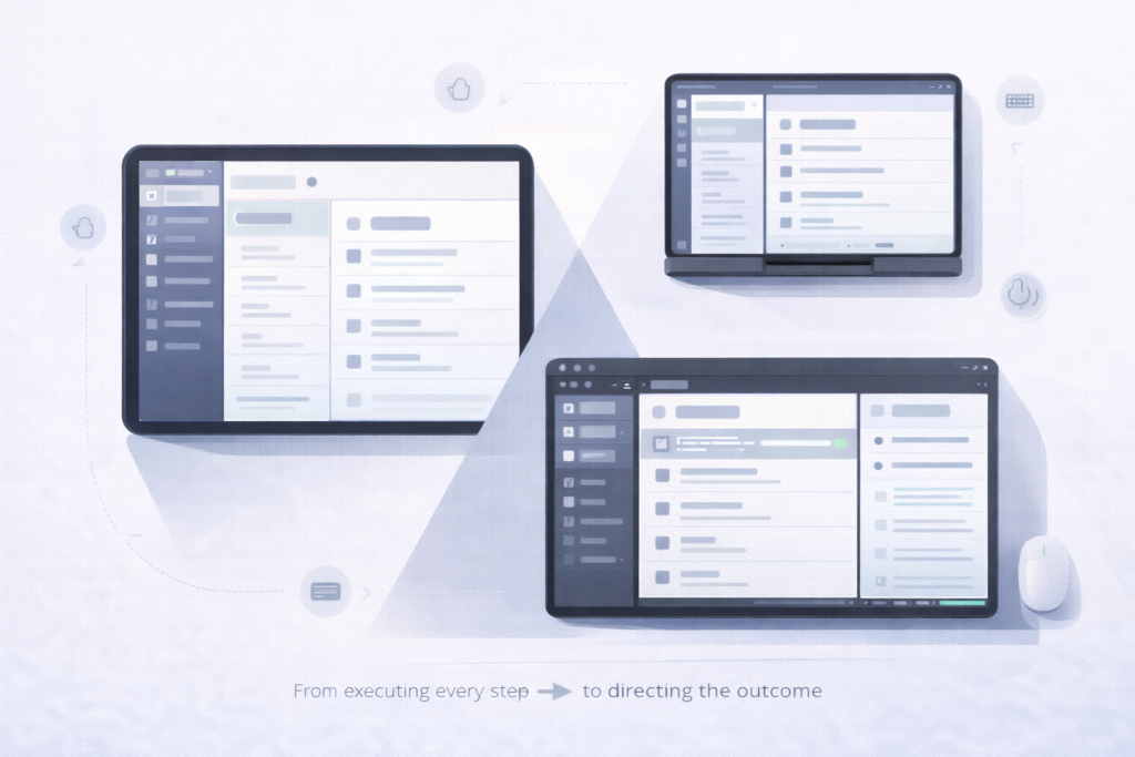
Adaptive layouts: the window is the unit, not the device
All three ecosystems have moved away from “design for devices” and toward “design for available space.”
Google’s Material 3 adaptive guidance is explicit: window size is dynamic and changes with user behavior—multi-window modes, resizing, and foldable postures—so layout should respond to window size classes rather than device labels. Material describes a set of window size classes (from compact through extra-large) and encourages layouts that reflow across these breakpoints. It also frames common UI structures in terms of 1–3 panes that can appear or collapse as space changes—an idea that maps cleanly to modern tablet and desktop UI.
Microsoft’s Windows app design guidance reaches a very similar place through different mechanics: responsive UI is commonly achieved with VisualStateManager and AdaptiveTrigger, so layouts rearrange automatically when a window hits a specified width/height threshold. Even Microsoft’s control guidance uses this approach for navigation patterns — switching, for example, between top navigation and a left/compact navigation model based on window width.
Apple’s Human Interface Guidelines speak the same “window-first” language: people can freely resize windows down to minimum sizes, and apps should account for that resizing behavior. Apple’s HIG also emphasizes that windows should adapt fluidly to different sizes to support multitasking and multiwindow workflows.
Similarity that matters: all three are teaching developers to treat UI as a responsive system driven by runtime constraints. Concretely, the design question is no longer “do we have a tablet layout?” but “what happens to our navigation, hierarchy, and content density when the window becomes medium, narrow, tall, split, or freeform?”
Multitasking: multiwindow is no longer optional behavior
The second convergence is that multitasking isn’t presented as a special mode; it’s treated as a default context that apps must survive.
Material’s layout guidance repeatedly anchors adaptation in scenarios like entering multi-window mode and resizing freeform windows, and it describes canonical patterns (like list-detail) that collapse from two panes to one when the window class shrinks. The framing is practical: layouts should keep working as the user changes the window, not only at app launch.
Apple’s platform guidance for multitasking similarly puts adaptation first: when supporting multitasking, your scenes should adapt to different window sizes, and Stage Manager/desktop-class features make resizable windows a core iPad experience rather than an edge case. Apple’s HIG sections on windows and multitasking reinforce that multiwindow workflows are expected and that window resizing is something the UI should handle gracefully.
On Windows, multitasking is essentially synonymous with windowing: users routinely resize, snap, and run multiple apps side by side. The Windows design hub explicitly frames guidance around consistent behavior across devices, input types, and form factors—meaning your app should still behave when it’s one window among many. The underlying adaptive UI model (states and triggers) exists precisely because multiwindow is normal, not exceptional.
Similarity that matters: across platforms, multitasking pushes the same engineering consequences: state restoration, layout performance during live resizing, and navigation that remains coherent when panes appear/disappear. The “design” problem is inseparable from lifecycle and state: a two-pane view that loses selection context when collapsing to one pane is a UX issue and a state-management issue at the same time.
Input methods: touch is table stakes; keyboard and pointer are first-class
The third convergence is input plurality. Touch-first assumptions are no longer safe, even on tablets.
On Windows, keyboard access and focusability are core accessibility and productivity concerns—Microsoft documents built-in support for access keys and keyboard interaction patterns that let users operate UI without a pointer.
Apple has spent years evolving iPad toward hybrid input. Official guidance and supporting material emphasize pointer/trackpad interaction and hardware keyboard workflows in iPad multitasking contexts (and, by extension, windowed environments). The HIG’s multiwindow push implicitly raises the importance of predictable focus, shortcuts, and pointer affordances, because windowed multitasking is strongly associated with keyboard/pointer usage.
Google’s adaptive layout framing is often paired with large-screen expectations that include keyboard, mouse/trackpad, and stylus across Android’s broader large-screen ecosystem—because the same layout needs to remain usable when interaction shifts from thumbs to cursor and keys. Material’s own multi-window framing underscores that layout must remain functional as the user changes context, which includes input context in real life.
Similarity that matters: the input problem is converging on the same checklist everywhere: reliable focus order, obvious hover/pressed states where relevant, keyboard accelerators/shortcuts, and controls that don’t depend on a single interaction model (e.g., swipe-only navigation with no keyboard alternative).
Why this convergence matters for app developers
This shared direction changes how teams should think about “platform support”:
- Adaptive layout becomes product work, not just UI polish. If your navigation model can’t collapse/expand cleanly (bottom bar ↔ side rail; single pane ↔ list-detail), you’ll feel it on iPad window resizing, Android multiwindow/foldables, and Windows snap layouts.
- State and navigation architecture are now design requirements. The better your app separates state from presentation and maintains meaningful selection/history across panes and window sizes, the more “native” it feels everywhere.
- Multi-input isn’t niche. The platforms are converging on the expectation that serious work happens with keyboards and pointers—even on devices that used to be touch-only.
The practical takeaway is simple: Apple, Google, and Microsoft aren’t asking developers to solve three different problems. They’re asking developers to solve the same problems—adaptive layout, multitasking resilience, and multi-input usability—through each platform’s idioms. If your app strategy treats those as a single design-and-architecture investment, you get leverage across ecosystems instead of re-litigating “tablet support” and “desktop support” as separate projects every year.