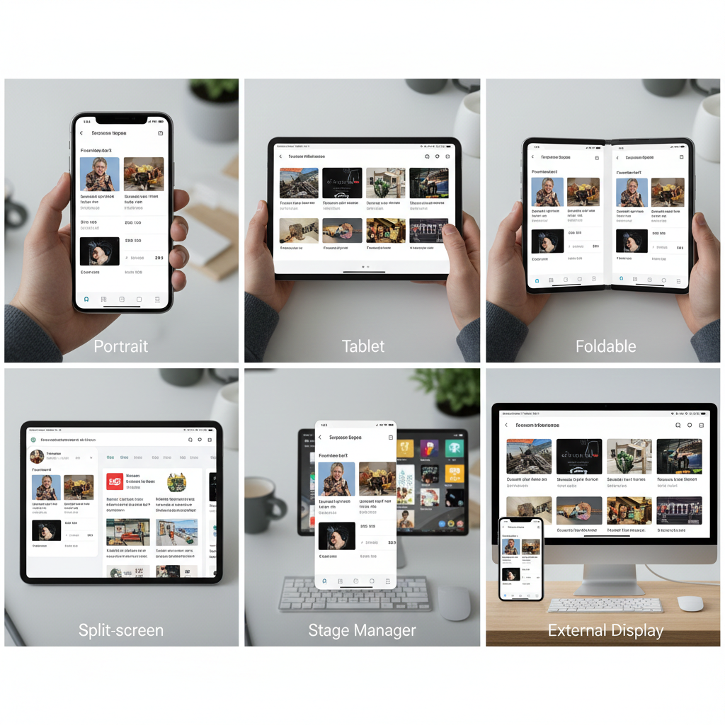
The idea of a “mobile app” doesn’t mean what it used to. Your app might launch on a phone held vertically in one hand, then minutes later appear on a tablet in landscape with a keyboard attached, or resize into a narrow column while the user multitasks with three other apps. Same user, same session, completely different contexts.
For mobile developers in 2026, “every screen” isn’t a nice-to-have feature or an enterprise requirement—it’s the baseline expectation. Users don’t think in terms of device categories anymore. They expect apps to work well wherever they happen to open them, whether that’s a foldable unfolding mid-task, a phone casting to an external display, or a tablet running three apps simultaneously in Stage Manager.
This shift changes everything about how we build apps. “Mobile-first” thinking assumed a primary form factor with occasional adaptations. Modern app development assumes constant variability. Your app isn’t just running on different devices—it’s running in different postures, with different input methods, in different multitasking configurations, often changing dynamically within a single session.
The challenge isn’t supporting more devices. It’s building systems that adapt gracefully to contexts you can’t fully predict. Here’s how to approach building apps that work everywhere without losing your mind—or your users.
1. The Reality of Modern Screens (It’s Not About Size Anymore)
Understanding modern screen diversity starts with unlearning what we thought we knew about device categories.
Screen Ranges Replace Fixed Devices
There’s no such thing as “the tablet size” or “the phone size” anymore. iPads range from 8.3 inches to 12.9 inches. Android phones span from compact 6-inch devices to 6.8-inch flagships that approach small tablet territory. Foldables transition between phone and tablet sizes mid-use.
More importantly, window sizes are often independent of physical screen size. Your app on a 12.9-inch iPad might occupy a 4-inch-wide column in Stage Manager. Your app on a 6.5-inch phone might be letterboxed when casting to a TV. The device tells you almost nothing about the actual space you have to work with.
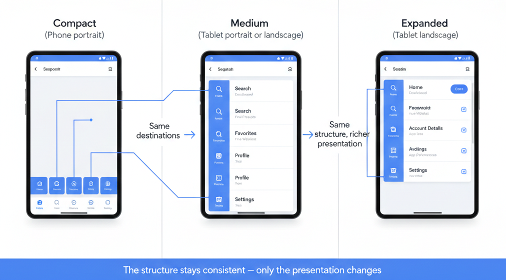
Modern frameworks recognize this with breakpoint systems based on actual available width, not device detection. Compact, medium, and expanded aren’t “phone, tablet, desktop”—they’re descriptions of how much space you actually have to present information.
Resizable Windows and Posture Changes
On Android, users can freely resize app windows in multi-window mode, dragging them to any width they want. On iPadOS, Stage Manager lets users adjust app sizes dynamically. Windows laptops running Android apps offer similar flexibility.
This means your layout can change at any moment, not just at app launch. Users expect this to work smoothly, not to trigger full-screen refreshes or lose their place in the app. Your UI needs to reflow gracefully, maintaining context across size transitions.
Foldables add another dimension: posture changes. A Galaxy Z Fold transitions from phone to tablet configuration as it unfolds, changing aspect ratio, screen size, and available space simultaneously. Your app needs to handle this transition while the user is actively using it.
External Displays and Unexpected Contexts
Phones mirror to TVs. Tablets connect to external monitors. Samsung DeX turns a phone into a desktop environment. Users increasingly expect apps to work in contexts you might never have tested.
The key insight: you’re not designing for specific hardware configurations. You’re designing for variability itself. The question isn’t “what does our app look like on an iPad Pro?”—it’s “how does our app adapt when available space changes, regardless of the underlying hardware?”
If you’re still thinking in terms of device detection and fixed breakpoints, you’re already behind. Modern apps need to be inherently adaptive, responding to actual available space and input methods rather than trying to recognize specific devices.
👉 Read more: Building once, running everywhere: what multi-device really means in 2026
2. Designing Experiences That Feel Right Everywhere
Adaptive layouts are pointless if the resulting experience feels awkward. The goal isn’t just to make your app “work” on different screens—it’s to make it feel natural and appropriate for each context.
Designing for Ranges, Not Devices
Effective multi-screen design starts with understanding that you’re creating a system, not a collection of device-specific layouts.
Think in terms of three core ranges:
- Compact: Limited width, vertical scrolling dominant, one thing at a time
- Medium: Enough space for related content, selective side-by-side layouts
- Expanded: Room for spatial organization, persistent navigation, multiple content areas
These aren’t device categories—they’re descriptions of how much information you can present comfortably. A compact layout might appear on a phone in portrait, a tablet in narrow split-screen, or an app in a Stage Manager column.
Using Space Intentionally
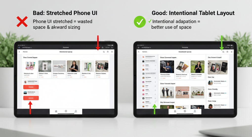
The biggest mistake in multi-screen design is stretching phone layouts to fill larger screens or cramming tablet layouts into smaller spaces. Both approaches fail because they don’t respect the purpose of the space.
On compact screens, embrace vertical flow. Users expect to scroll. Trying to fit everything “above the fold” creates cramped, cluttered interfaces. Focus on one primary task at a time.
On expanded screens, use horizontal space for meaningful relationships. Show list and detail together when both are relevant. Provide persistent navigation instead of hiding it behind menus. Let users see related information simultaneously.
The key is intentionality: every use of space should serve a purpose. Empty space is better than stretched interfaces, and dense layouts are better than artificial expansion.
Content Density and Readability
What’s readable on a 6-inch phone held 12 inches from your face is uncomfortably large on a 13-inch tablet held 24 inches away. What’s comfortably dense on a tablet is cramped and tappable on a phone.
Adapt your content density to match viewing distance and input precision. Larger screens typically mean more distance, which means you can increase information density without sacrificing readability. Smaller screens need more whitespace and larger touch targets because precision is harder.
This isn’t just about font sizes—it’s about how much information appears simultaneously, how tightly grouped interactive elements are, and how much effort users need to exert to parse what they’re seeing.
👉 Read more: Designing apps that actually feel good on phones, tablets, and foldables
3. Navigation That Adapts Without Confusing Users
Navigation is where most multi-screen apps fall apart. It’s easy to make navigation “work” at different sizes. It’s hard to make it feel coherent across those sizes.
Navigation as a System, Not a Component
The mistake most developers make is treating navigation as a component you swap out at different breakpoints. Bottom nav for phones, side drawer for tablets, top tabs for certain contexts. This creates fragmentation—users learn your navigation once on their phone, then encounter a completely different system on their tablet.
Better approach: think of navigation as a system that moves and reorganizes, but maintains consistency in structure and behavior. The same top-level sections should exist regardless of screen size. The same hierarchy should be apparent. Only the presentation changes.
When Bottom Nav Breaks
Bottom navigation works beautifully on phones in portrait. It’s ergonomic, always visible, and provides direct access to top-level sections. But it fails on larger screens and landscape orientations.
On tablets, bottom navigation wastes vertical space and creates an awkward visual balance. The navigation is distant from the content it controls. Users’ hands aren’t naturally positioned at the bottom of a 12-inch screen.
In landscape, bottom navigation consumes critical horizontal space and often feels cramped.
The solution isn’t to replace bottom nav entirely—it’s to transition it. On medium and expanded screens, bottom nav can become a side rail (still persistent, but better positioned) or integrate into a top navigation system. The key is maintaining the same destinations and structure, just repositioned.
When Side Nav Helps
Side navigation—whether as a rail or a drawer—makes sense when you have horizontal space and vertical content. It keeps navigation visible while leaving content area unobstructed. It scales well when you have many destinations or hierarchical structure.
But side nav fails when it’s just bottom nav rotated 90 degrees. Don’t take five icons and stack them vertically if they worked horizontally—that’s not adaptation, that’s just rotation.
Avoiding Redundant Controls
One of the worst multi-screen experiences is navigation that multiplies. You see this when apps keep bottom nav AND add a side drawer AND include top navigation, all providing overlapping access to the same destinations.
Redundant navigation doesn’t help users—it creates decision fatigue and makes the interface feel cluttered. If your app has three ways to get to settings, you haven’t made settings more accessible; you’ve just added visual noise.
Navigation should move and reorganize across screen sizes, not multiply. The number of top-level destinations shouldn’t change based on screen size. The entry points should be clear and singular, just positioned differently.
👉 Read more: What breaks first when your app goes multi-device (and how to avoid it)
4. Multi-Window and Multitasking: Where Theory Meets Reality
Building for “every screen” isn’t just about supporting different screen sizes—it’s about handling the reality that your app is rarely the only thing users are looking at.
Split-Screen Usage Patterns
On Android and iPadOS, users regularly run apps side-by-side. Your app might occupy half the screen, a third, or a resizable portion that changes as users adjust the split.
The critical insight: split-screen isn’t an edge case for power users. It’s how normal people multitask. They’re watching a video while texting, comparing prices while shopping, taking notes while reading, following a recipe while checking messages.
Your app needs to work well when it’s not the primary focus. It needs to handle narrow widths gracefully. It needs to maintain state when users switch focus to the other app. It needs to respond to dynamic resizing as users adjust the split ratio.
Live Resizing and State Preservation
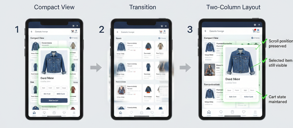
Users don’t resize your app once and leave it. They adjust splits during active use. They rotate devices mid-task. They fold and unfold foldables while viewing content.
Every resize is an interruption. If your app reloads content, resets scroll position, or loses form input during these transitions, you’ve broken the user’s flow.
The technical challenge: preserving meaningful state through layout changes without breaking performance. The UX challenge: making these transitions feel smooth and predictable, not jarring.
Minimize, Restore, and Overlap
On desktop environments (DeX, Windows subsystems, Chrome OS running Android apps), your app can be minimized, restored, overlapped by other windows, and partially obscured.
Users expect desktop-like window behavior in these contexts. Your app should handle being background, return quickly when foregrounded, and work sensibly when only partially visible.
The mistake developers make is assuming mobile apps always run full-screen. Modern reality: your app shares space constantly. Design for interruption and background state as normal conditions, not edge cases.
External Displays
Phone mirroring to TVs, tablet external monitor support, and desktop docking modes mean your app might render on screens you’ve never considered.
The challenge isn’t just size—it’s input methods and viewing distance. A UI designed for touch at 12 inches might appear on a 50-inch TV viewed from 10 feet away. Controls that work with fingers might be awkward with a remote or mouse.
You can’t test every scenario, but you can design resilient systems that adapt to available space and degrade gracefully in unexpected contexts.
👉 Read more: Multi-window, multi-screen, multi-problem: lessons from real-world apps
5. Input Changes Everything (Touch, Keyboard, Mouse, Stylus)
Screen size gets all the attention, but input method defines how users actually interact with your app. The same interface can feel completely different depending on whether someone’s using touch, a keyboard, a mouse, or a stylus.
Touch vs Precision Input
Touch interfaces need larger targets, more spacing, and forgiving hit areas. Mouse interfaces can handle smaller controls, denser layouts, and hover interactions. Keyboard interfaces need visible focus states and logical tab order.
The problem: modern devices support multiple input methods simultaneously, and users switch between them fluidly. A tablet user might primarily use touch, occasionally grab a keyboard for text entry, and use an Apple Pencil for annotations.
Your app can’t assume a single input method. It needs to work well with all of them, adapting interaction patterns to match what the user is actually doing.
Keyboard Navigation Expectations
When someone attaches a keyboard to their tablet or phone, they expect keyboard shortcuts to work. Tab should move focus logically through interactive elements. Arrow keys should navigate lists. Standard shortcuts (Cmd+S, Cmd+F) should do expected things.
Most mobile apps fail here completely. They’re designed for touch and treat keyboard input as an afterthought. This creates frustration for users who want to work efficiently with external keyboards.
The fix isn’t complicated: proper focus management, visible focus indicators, logical tab order, and handling standard keyboard shortcuts. But it requires thinking beyond touch-first design.
Hover States and Progressive Disclosure
On devices with mice or trackpads, hover states provide valuable progressive disclosure. You can show additional context, reveal actions, or provide tooltips without cluttering the default view.
But hover doesn’t exist on touch devices. Any critical functionality hidden behind hover is inaccessible to touch users.
The solution: use hover for enhancement, never for essential functionality. Show additional context on hover for precision input users, but ensure touch users can access the same information through taps or long-presses.
Gesture Fallbacks
Gestures like swipe-to-delete or pinch-to-zoom are intuitive on touch but don’t map to keyboard or mouse input. Every gesture needs a fallback—an explicit button or menu option that achieves the same result.
This isn’t just accessibility—it’s usability. Some touch users never discover gestures. Users with external input devices can’t perform them. Gestures should be shortcuts for efficiency, not the only way to accomplish tasks.
The key principle: input method should never determine whether users can accomplish a task, only how efficiently they can do it.
6. State, Performance, and Trust
Multi-screen apps have a hidden requirement that breaks user trust when violated: state preservation. If resizing your app causes content to reload, forms to clear, or scroll position to reset, users will avoid resizing—or worse, avoid your app entirely.
Preserving State Across Resizes
When your app transitions from compact to expanded layout, users expect their context to remain intact. If they were reading an article, they should stay at the same position. If they were filling out a form, their input should persist. If they had a modal open, it should remain open.
This sounds obvious, but it’s technically challenging. Layout changes often trigger lifecycle events that reset state. Components remount. ViewModels recreate. State gets lost.
The fix requires deliberate architecture: separating presentation state (which can change) from content state (which must persist). Using proper state management that survives configuration changes. Testing explicitly for state preservation during resizes.
Avoiding Layout-Triggered Re-renders
Performance problems in multi-screen apps often stem from unnecessary re-renders during layout changes. When available space changes, components recalculate layout, which triggers measurements, which causes re-renders, which can create cascading updates throughout your component tree.
For simple layouts, this happens fast enough to not matter. For complex UIs—especially those with lists, grids, or data visualizations—this can cause visible lag or frame drops during resizes.
The solution: memoization, proper dependency management, and avoiding layout calculations that trigger business logic. Separate layout concerns from data concerns. Let layout change without forcing data to reload.
Performance Consistency Across Sizes
An app that performs smoothly on a phone but stutters on a tablet feels broken, even if it’s technically functional. Users expect consistent performance regardless of screen size.
The challenge: larger screens often mean more content visible, more complex layouts, and more pixels to render. Naive scaling can destroy performance.
Test performance at every breakpoint. Profile frame rates during resizes. Ensure your app isn’t just functional at large sizes but actually pleasant to use. Smooth performance builds trust; janky performance destroys it.
Why Losing State Destroys Trust
Every time users resize your app and lose their place, they learn not to resize your app. They keep it small on tablets even though larger layouts would be better. They avoid multi-window mode. They work around your app instead of with it.
State preservation isn’t a technical detail—it’s a trust signal. It tells users whether your app respects their context and workflow. Get it wrong, and everything else you’ve built becomes less valuable.
👉 Read more: What breaks first when your app goes multi-device (and how to avoid it)
7. Feature Scaling: Why Parity Is the Wrong Goal
One of the most common mistakes in multi-screen development is assuming every feature should work identically everywhere. Feature parity sounds like fairness, but it often results in compromised experiences across all screen sizes.
Why “Everything Everywhere” Fails
Trying to provide every feature at every screen size forces compromises that make nothing work well. Complex features get cramped on small screens. Simple features feel lost on large screens. Navigation becomes cluttered trying to expose everything everywhere.
The better approach: selective capability based on context. Some features genuinely work better on larger screens. Some features make sense only with certain input methods. Some features are optimized for specific usage contexts.
This doesn’t mean arbitrary restrictions—it means honest assessment of where features actually provide value.
When Features Should Scale Up
Data-rich features benefit enormously from larger screens. Analytics dashboards, comparison tools, detailed forms, multi-panel workflows—these improve dramatically when they can use more space intelligently.
On compact screens, these features might work, but they require scrolling, tabbing between views, or hiding information. On expanded screens, you can show related information simultaneously, reduce navigation overhead, and provide richer visualization.
Scale these features up by using additional space for meaningful relationships, not just making everything bigger. Show list and detail together. Display comparison views side-by-side. Provide richer data visualizations that would be cramped on smaller screens.
When Features Should Disappear
Some features don’t scale down well and shouldn’t try. Complex editing tools designed for precision input don’t work well on small touch screens. Features that require seeing large amounts of information simultaneously can’t be forced into compact layouts without compromising their usefulness.
It’s okay for certain features to be unavailable on compact screens if the alternative is a frustrating, barely-functional experience. Be honest with users: “This feature works best on tablets” is better than pretending a terrible experience is acceptable.
Respecting User Context
The decision about which features to show where shouldn’t be arbitrary—it should reflect actual user needs in different contexts.
People using phones are often on the go, focused on quick tasks, working with one hand. Features that require sustained attention, complex input, or detailed analysis are poor fits for this context.
People using tablets or desktop environments are often settled in, have more time, can use external input devices. This context supports different feature sets.
Match feature availability to context, and users will understand. Force features into inappropriate contexts, and users will be frustrated.
👉 Read more: Apple, Google, and Samsung are all betting on on-device AI (as an example of selective capability rollout)
8. Where AI Helps — And Where It Doesn’t
AI tools have changed how we build multi-screen apps, but not always in the ways the hype suggests. Understanding where AI genuinely accelerates development versus where it creates new problems is critical for modern mobile developers.
AI in IDEs for Layout and Refactoring
AI excels at generating responsive layout code. Describe a layout structure—”two-column grid that collapses to single column on compact screens”—and modern AI tools can generate working SwiftUI or Compose code that implements it correctly.
This acceleration is real. What used to take 20 minutes of writing constraints and testing breakpoints now takes 2 minutes of reviewing and refining AI-generated code. For boilerplate layout work, AI genuinely saves time.
AI also helps with refactoring existing layouts to be responsive. It can identify hard-coded sizes, suggest adaptive alternatives, and help migrate View-based layouts to Compose or SwiftUI patterns.
Faster Iteration, Not Better Decisions
Where AI doesn’t help: making the actual design decisions about how your app should adapt. AI can generate a responsive layout, but it can’t tell you whether showing list and detail together on tablets is the right choice for your app. It can’t determine which navigation pattern fits your content structure. It can’t balance feature availability across screen sizes.
These decisions require understanding your users, your content, and your product goals. AI provides implementation speed, not design insight.
The risk is using AI’s implementation suggestions as design validation. “AI suggested this layout, so it must be right” is a trap. AI generates plausible patterns, not optimal solutions for your specific context.
Avoiding AI-Driven Design Shortcuts
The biggest mistake I see: developers using AI to bypass learning responsive design principles. AI can generate adaptive layouts, but if you don’t understand why the generated code works, you can’t evaluate whether it’s the right approach or debug when it fails.
Use AI to accelerate implementation of designs you understand. Don’t use it to avoid understanding responsive design fundamentals. The developers who get the most value from AI tools are those who already know how to build responsive UIs manually—they use AI for speed, not as a replacement for knowledge.
👉 Read more: AI in IDEs: what actually helps developers (and what gets in the way)
9. Testing for Real Usage, Not Ideal Demos
The gap between “our app works on tablets” and “our app actually works well when people use tablets” is enormous. That gap is where most multi-screen apps fail.
Resizing Mid-Task
Don’t just test your app at different sizes—test resizing during active use. Fill out a form, then resize. Scroll through a list, then switch orientations. Play a video, then enter split-screen mode.
Real users don’t launch your app at optimal size and leave it there. They resize dynamically, often while in the middle of tasks. Your app needs to handle these transitions gracefully without losing state, breaking layouts, or interrupting workflows.
Multi-Window Testing
Test your app actually running alongside other apps, not just in multi-window mode in isolation. See how it behaves when the other app is playing audio. When notifications appear from the other app. When users switch focus back and forth rapidly.
The real-world scenario isn’t your app in a carefully controlled split-screen demo—it’s your app competing for attention with messages, videos, documents, and everything else users do simultaneously.
Keyboard-Only Flows
Attach a keyboard and try using your app without touching the screen. Can you navigate with tab? Do focus states make it clear where you are? Do standard shortcuts work? Can you accomplish core tasks efficiently?
If keyboard navigation feels like an afterthought, it is—and users with keyboards will notice immediately. This isn’t just accessibility; it’s basic usability for the growing number of users who attach keyboards to tablets and expect desktop-like efficiency.
Long-Session Fatigue
Test your app during extended sessions at different sizes. What feels fine for 5 minutes might become uncomfortable after 30. Information density that seems efficient initially might feel overwhelming during sustained use.
Long-session testing reveals issues that quick demos miss: font sizes that strain eyes over time, navigation patterns that become tedious with repetition, layouts that waste space in ways that accumulate frustration.
The key principle: if it feels awkward to you during testing, it will feel worse to users in real contexts. Don’t rationalize away discomfort—it’s signal that something needs improvement.
10. A Practical Mental Model for Every-Screen Apps
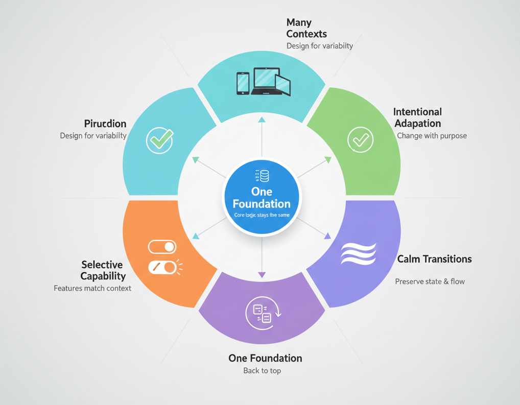
After years of building apps for multiple screens, I’ve settled on a mental model that helps make good decisions quickly. Think of every-screen apps as having five key principles:
One Foundation
Your app’s core functionality, data model, and business logic should be identical regardless of screen size. The foundation doesn’t change—only the presentation layer adapts.
This principle keeps you from creating divergent codebases where tablet and phone versions drift apart, accumulating different bugs and requiring separate maintenance.
Many Contexts
Users encounter your app in wildly different contexts: rushed and mobile, settled and focused, multitasking and distracted, on large displays with precision input, on small screens with one hand.
Design for context diversity, not device diversity. The question isn’t “how does this work on an iPad” but “how does this work when someone has space, time, and a keyboard?”
Intentional Adaptation
Every adaptation should serve a purpose. Don’t change layouts just because you can—change them because the different context enables a better experience.
Ask: “Why is this different at this size?” If the answer is “because it’s a tablet” rather than “because we can show related information together,” you’re adapting arbitrarily, not intentionally.
Calm Transitions
State should persist. Layouts should reflow smoothly. Users shouldn’t notice the technical complexity of what’s happening during resizes or orientation changes.
The best multi-screen experiences feel effortless because the transitions are calm and predictable. The worst feel fragile because every change triggers visible problems.
Selective Capability
Not everything needs to work everywhere. Features can scale based on available space and input methods, as long as the logic is defensible and communicated clearly.
Don’t apologize for selective capability—embrace it as honest design. An excellent small-screen experience with a subset of features beats a cramped everything-everywhere compromise.
This mental model provides a framework for making countless micro-decisions during development. When you’re unsure whether to show something differently at different sizes, run it through these principles. Usually the right answer becomes clear.
11. Conclusion: Building for Change, Not Devices
The screens we’re building for today won’t be the screens we’re building for in three years. New form factors will emerge. Window management will evolve. Users will develop new multitasking patterns. The specific devices and contexts will change.
What won’t change: the need for apps that adapt gracefully to variability.
The mistake most developers make is optimizing for current devices—adding specific support for today’s foldables, today’s tablet sizes, today’s desktop environments. This approach is always behind, always reactive, always accumulating device-specific code that becomes technical debt.
The better approach: build systems that are inherently adaptive. Design for ranges, not specific sizes. Handle input methods generically, not device by device. Preserve state through transitions regardless of what triggers them. Think in terms of available space and user context, not hardware models.
Apps built this way don’t just work on current devices—they work on devices that don’t exist yet. They handle unexpected contexts gracefully because they’re designed for variability itself, not specific variants.
This mindset shift—from device targeting to adaptive systems—is the fundamental change required for modern app development. It’s harder initially because it requires thinking more abstractly about interface design. But it’s sustainable in ways that device-specific optimizations never are.
Building for Every Screen Is About Respect
Ultimately, building for every screen isn’t a technical challenge—it’s a commitment to respecting how people actually use technology.
Respecting that users don’t think about device categories—they just open your app wherever they happen to be and expect it to work.
Respecting that context changes constantly—users fold devices, resize windows, rotate screens, and your app should adapt calmly without losing their place.
Respecting that input methods vary—some people use touch, some use keyboards, some switch between both, and all deserve thoughtful interactions.
Respecting that not everyone uses your app the way you designed it—they multitask, they resize, they use accessibility features, and your app should support their workflows, not fight them.
When you approach multi-screen development this way—as respect for user agency and context diversity rather than a checklist of device support—the technical decisions become clearer. You’re not asking “should we support this device?” but “how do we respect this usage pattern?”
Building apps for every screen isn’t about supporting everything. It’s about respecting context, embracing variability, and creating systems that adapt gracefully to however users choose to engage with your app.
The screens will keep changing. The assumptions will keep breaking. The apps that win will be the ones that adapt calmly and respect their users’ contexts—whatever those contexts turn out to be.