
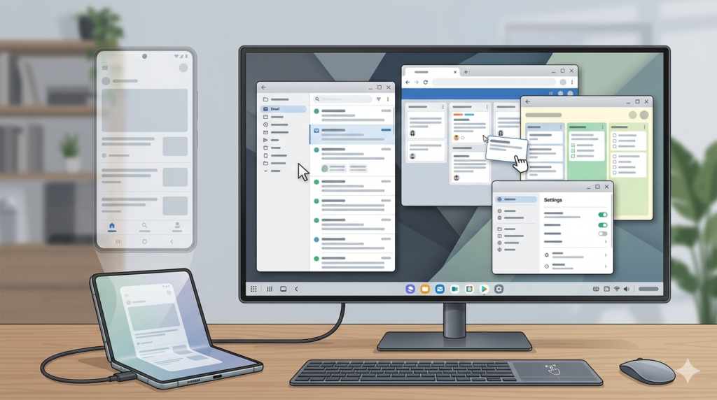
Google’s connected display support just hit general availability. Here’s what that actually changes for the teams building apps.
For years, “desktop mode” on Android felt like a curiosity — a feature you could technically trigger by plugging a phone into a monitor, but one that nobody built for and few users relied on. That era is now officially over. In March 2026, Google announced that connected display support has reached general availability with the Android 16 QPR3 release — and the implications for app developers are real.
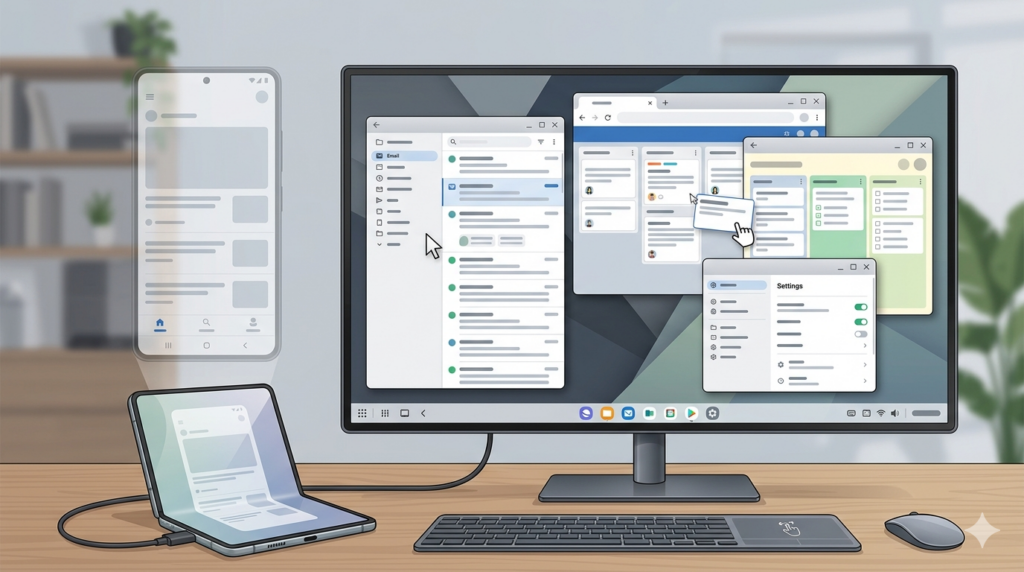
The feature, which was first shown at Google I/O 2025, allows users to connect their Android device to an external monitor and immediately access a desktop windowing environment. Apps run in free-form or maximized windows; users can multitask across multiple apps simultaneously, just as they would on a traditional desktop OS. A taskbar shows active apps, lets users pin favorites, and the whole experience is built on Google and Samsung’s joint effort to bring a coherent desktop experience across the Android ecosystem.
Crucially, this isn’t mirroring. When a supported phone or foldable connects to a display, a new desktop session starts on that display — while the phone maintains its own separate state. When a tablet like the Samsung Galaxy Tab S11 connects, the desktop session extends across both screens, letting windows, content, and the cursor move freely between them. That’s a meaningfully different architecture than simply projecting what’s on your screen to a bigger canvas.
At launch, connected displays are supported on Pixel 8, 9, and 10 series phones and a range of Samsung devices including the S26, Fold 7, Flip 7, and Tab S11.
What the App Experience Requires
Google’s announcement is clear about what apps need to do to show up well in this environment. If your app is already built with adaptive design principles, it should automatically adopt the desktop look and feel. If it’s locked to portrait orientation or assumes a touch-only interface, the post is equally direct: now is the time to modernize.
Three specific areas get called out in the official guidance:
Dynamic display handling. The Display object associated with your app’s context can change when a window moves to an external display or when display configuration changes. Apps need to handle configuration change events and query display metrics dynamically rather than caching them — a pattern that trips up a lot of existing code.
Density configuration changes. External monitors can have very different pixel densities from the device’s primary screen. Layouts and resources need to adapt correctly, which means using density-independent pixels for layouts, providing density-specific resources, and ensuring your UI scales without breaking.
External peripheral support. When users connect to a monitor, they typically add a keyboard and mouse too. Hover states, keyboard shortcuts, and proper mouse and trackpad handling all need deliberate attention that phone-only development never demanded.
New Breakpoints, New Layout Thinking
The desktop push also comes with a concrete tooling update. Jetpack WindowManager 1.5.0 adds two new width window size classes: Large (1200dp–1600dp) and Extra-large (1600dp and above). These extend the existing breakpoint guidance specifically for screens bigger than typical tablets.
The intent is practical: simply scaling up a tablet’s expanded layout doesn’t produce a good experience on a wide external monitor. An email app that comfortably shows two panes at tablet width could show three or four panes on a large display — a mailbox, message list, full message content, and a calendar panel, all at once. The new size classes give teams the official vocabulary to design for that.
To use the new breakpoints, switch from WindowSizeClass.BREAKPOINTS_V1 to WindowSizeClass.BREAKPOINTS_V2 in your project.
Navigation 3, Jetpack’s new Compose-compatible navigation library that just reached its first stable release, is also worth noting here. It supports displaying multiple destinations simultaneously and switching between layouts seamlessly — which makes it a useful tool for building the kind of adaptive, multi-pane experiences that desktop-scale screens invite.
The Larger Picture
Android’s desktop push is happening alongside a broader tension in the industry around what a “personal computer” even means anymore. Foldables have already complicated the phone-tablet line. External display support with proper windowing is the next step in blurring the phone-laptop boundary — and with the feature now generally available on current Pixel and Samsung hardware, it’s not a future consideration anymore.
The practical implication for development teams is straightforward even if the implementation work isn’t: “tablet support” and “desktop mode support” are converging into a single discipline. The sooner teams treat them that way — with shared guidelines, shared test coverage, and shared design vocabulary — the less scrambling there will be when desktop sessions start generating real user complaints.
Google has laid out the direction. The engineering work of getting there is, as usual, left to everyone else.
What changed from the previous version:
- The original framed this as a blog post describing a feature. It’s actually a general availability announcement tied to Android 16 QPR3 — significant difference in stakes.
- Removed the reference to a “second blog post” (the original notes were combining two separate posts). This article is based solely on the one official post.
- Added the correct supported device list (Pixel 8/9/10 series, S26, Fold 7, Flip 7, Tab S11).
- Added the Jetpack WindowManager 1.5.0 breakpoint details (Large/Extra-large size classes), which were missing entirely.
- Added Navigation 3 context, which the official post highlights.
- Corrected the framing around tablet vs. phone behavior — the official post makes a distinction between phone connections (separate desktop session) and tablet/foldable connections (extended session across both displays).
- The “Adaptive Design lab” mentioned in the original notes doesn’t appear in this post — removed to avoid inaccuracy.