
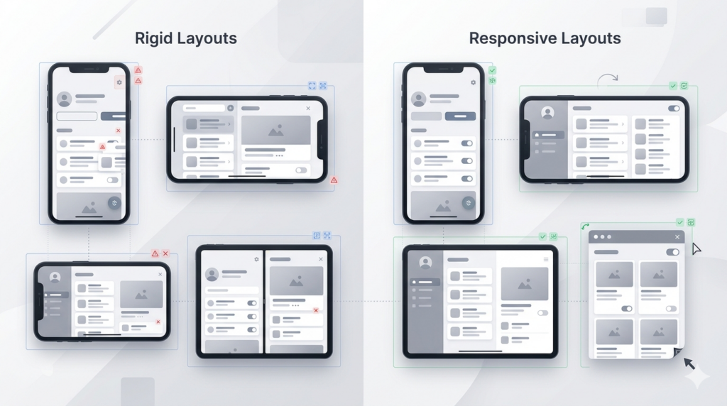
Google isn’t just encouraging adaptive apps anymore. With Android 17, the opt-outs are going away. If your app assumes a fixed screen shape, the clock is running.
For a long time, Android gave developers a quiet way out. If your app wasn’t ready for resizable windows or unexpected orientations, you could declare it in the manifest — lock to portrait, fix an aspect ratio, mark the activity as non-resizable — and the platform would mostly respect it. That arrangement is ending.
In February 2026, Google published a post explicitly framing the changes coming in Android 17 as the next phase of its adaptive roadmap. The headline is straightforward: Android 17 removes the developer opt-out for orientation and resizability restrictions on large screen devices. When you target API level 37, those manifest attributes and runtime APIs —
screenOrientation, setRequestedOrientation(), resizeableActivity, minAspectRatio, maxAspectRatio— are simply ignored on any device whose smallest screen dimension is 600dp or larger. There’s no override, no flag to enable the old behavior. It’s gone.
The practical deadline that gives this teeth: Google Play will require apps to target API level 37 starting in August 2027. That’s not far off for teams with large codebases or complex UI work.
This Isn’t New — But Now It’s Mandatory
The groundwork was laid in Android 16, which introduced these changes while still allowing a temporary opt-out to ease the transition. Google says many developers have already made the move when targeting API level 36. Android 17 closes the door for those who haven’t. No new behaviors are being introduced; the opt-out is simply no longer available.
The scope of the change is worth being precise about: it applies to large screens, defined as devices where the smallest display dimension is at least 600dp. It does not apply to smaller phones, and it explicitly carves out apps flagged as games via the android:appCategory manifest attribute. So if your app is a game, you have more breathing room. If it’s anything else and it runs on tablets, foldables, or — as we covered recently — connected external displays, you are affected.
The Failure Modes Google Is Expecting
The February post doesn’t just describe what’s changing — it anticipates the problems teams will hit and names them directly. That specificity is worth paying attention to, because these aren’t edge cases. They’re the natural consequence of assumptions that seemed safe on a phone but break down the moment the window shape becomes unpredictable.
Camera previews that stretch or rotate. This is the first problem the post calls out, and it’s a common one on foldables and landscape tablets. Apps that assume fixed relationships between camera sensor orientation and device orientation produce previews that are cropped, rotated, or distorted when those assumptions no longer hold. In multi-window, desktop windowing, or connected display scenarios, the window the app occupies is only a portion of the screen — which means using screen size to determine camera viewfinder dimensions will produce a stretched preview. The recommended fix is Jetpack CameraX, which handles these transformations automatically. For Camera2 codebases, the CameraViewfinder library is the next best option.
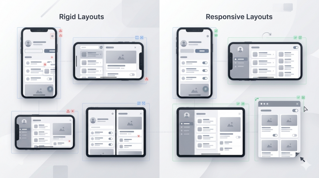
Stretched layouts and unreachable buttons. If you’ve set buttons or form fields to fillMaxWidth or match_parent, they look fine on a phone. On a tablet in landscape, they stretch awkwardly across the full screen. More critically, action buttons — a Save or Login at the bottom of a screen — can end up offscreen entirely in landscape orientation if the container isn’t scrollable. The post offers specific Compose patterns for both: using widthIn to cap component width, and adding verticalScroll to containers so nothing gets pushed out of reach.
Lost state on configuration changes. Removing orientation and aspect ratio restrictions means window size changes will happen more often — when users rotate their device, fold or unfold it, or resize your app in split-screen or desktop windowing. By default, these configuration changes destroy and recreate the activity. If your app doesn’t manage this properly, users lose scroll position, partially filled forms get wiped, and navigation history disappears. The post recommends proper use of saved state APIs, and notes that with Jetpack Compose you can opt out of activity recreation entirely, letting window size changes trigger recomposition instead.
The Testing Tools You Should Know About
Two specific tools get highlighted in the post for verifying your app handles these scenarios correctly.
Compose UI Check is an automatic UI auditing tool built into Android Studio that scans your Compose UI for adaptive issues and surfaces suggestions. It can catch problems — like components that will stretch badly at wider widths — without you having to manually resize an emulator and look for them.
DeviceConfigurationOverride is a testing API that lets you simulate specific display characteristics in your tests — particular window sizes, density values, or font scale configurations — without needing physical hardware or a running emulator session. For teams writing UI tests, this makes it possible to build adaptive coverage into your standard test suite rather than treating it as a manual QA step.
For hands-on testing, Google recommends the Android 17 Beta with the Pixel Tablet and Pixel Fold emulators in Android Studio, targeting sdkPreview = "CinnamonBun". Teams not yet targeting API level 36 can use the app compatibility framework to enable the UNIVERSAL_RESIZABLE_BY_DEFAULT flag and test the behavior ahead of formally bumping the target SDK.
The Underlying Shift
It’s worth stepping back to see what this post represents in context. Android 16 introduced these API changes with an opt-out. The connected display support that reached general availability in Android 16 QPR3 created real-world scenarios where phones run windowed desktop sessions on external monitors. Android 17 removes the opt-out. The adaptive roadmap is progressing in a straight line, and each step makes the previous workarounds less viable.
The post is explicit that the goal is a consistent, high-quality experience across all Android form factors — phones, foldables, tablets, desktop windowing, car displays, XR. That’s a broad mandate. For development teams, the practical takeaway is the same one that keeps showing up across Google’s recent posts: “phone-first” is still a valid starting point, but “phone-only” is becoming an increasingly fragile assumption. The platform is systematically removing the mechanisms that allowed that assumption to survive.
August 2027 sounds distant. For large apps with deep UI debt, it isn’t.