
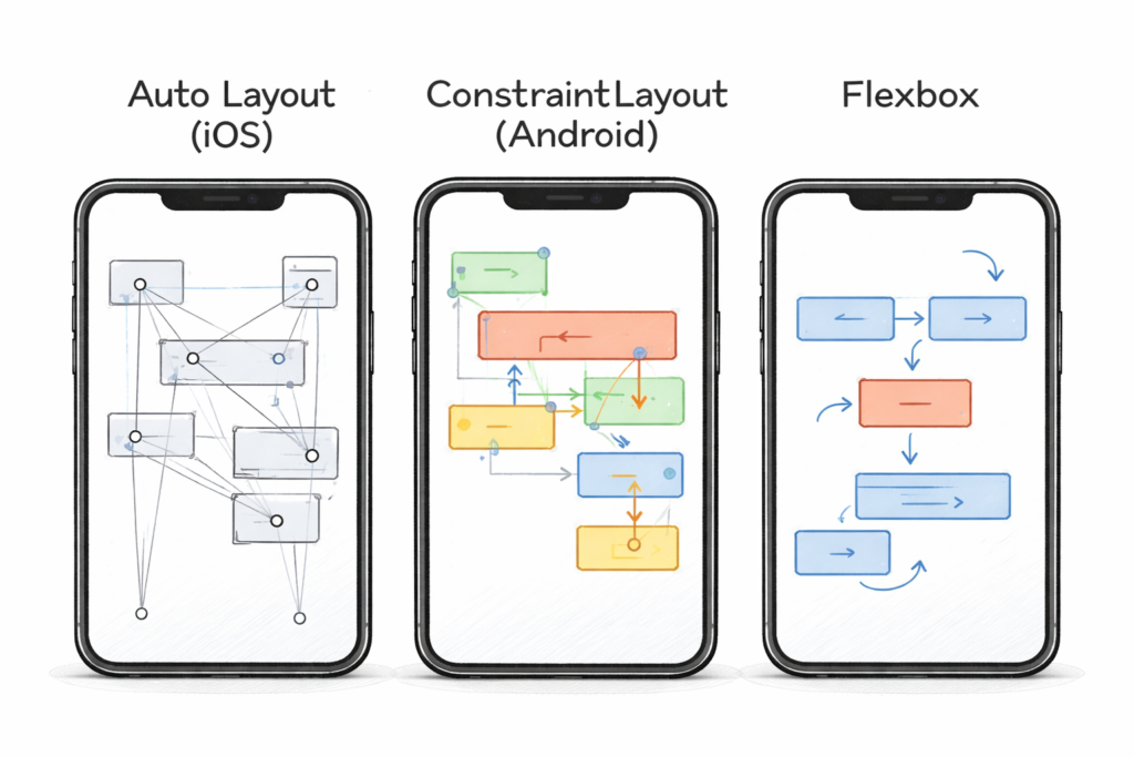
The first thing to break is almost always the layout.
Common symptoms:
- Text lines become uncomfortably wide
- Important actions drift to awkward corners
- Empty space appears with no purpose
- UI feels “stretched” instead of designed
These issues don’t show up on emulators with a few preset sizes. They appear when:
- The app is resized mid-session
- A foldable changes posture
- Multi-window kicks in
Why it happens
Layouts were designed for fixed dimensions, not flexible ranges.
How to avoid it
- Design around size classes or ranges, not devices
- Use max-widths for readable content
- Let layouts reflow, not just scale
👉 Designing apps that actually feel good on phones, tablets, and foldables
If your layout logic can’t explain why something moves, it will feel wrong when it does.
2. Navigation becomes confusing or redundant
Navigation systems that feel fine on phones often fall apart on larger screens.
What breaks:
- Drawers that feel unnecessary on tablets
- Bottom navigation floating awkwardly in wide layouts
- Duplicate navigation controls appearing at once
Users don’t just notice this — they lose confidence in the app.
Why it happens
Navigation was treated as a static component instead of a system that adapts to space.
How to avoid it
- Let navigation change position as space increases
- Avoid showing the same controls in multiple places
- Keep destinations consistent even if presentation changes
Navigation should evolve with space, not stubbornly stay the same.
3. State breaks during resizing and multitasking
Multi-device apps live in a world of constant interruption:
- Resizing
- Splitting screens
- Minimizing and restoring
- Folding and unfolding
The first serious bugs many teams hit are state-related:
- Lost scroll position
- Reset forms
- Disappearing selections
- Reloaded screens mid-task
Why it happens
State is tied too closely to layout or lifecycle assumptions.
How to avoid it
- Separate UI state from layout state
- Treat resize events as normal, not exceptional
- Preserve user intent aggressively
If resizing your app feels like restarting it, users won’t trust it.
4. Input assumptions start to fail
Screen size gets attention. Input method usually doesn’t — until things feel off.
What breaks:
- No keyboard navigation
- Invisible focus states
- Hover-dependent UI on touch devices
- Touch-only gestures on desktop
On larger devices, users expect precision and speed. An app designed purely for touch often feels slow and clumsy with a keyboard and mouse.
Why it happens
Input was assumed, not designed.
How to avoid it
- Support keyboard navigation early
- Make focus visible and predictable
- Avoid gestures as the only way to act
If users can’t tell what’s focused, they’ll feel lost.
5. Performance degrades unevenly
Multi-device doesn’t mean equal hardware.
What breaks:
- Smooth phone performance, laggy tablet experience
- Expensive recompositions during resizing
- Animations that stutter on larger layouts
These issues often go unnoticed until late testing.
Why it happens
Performance was tuned for one form factor.
How to avoid it
- Test performance across size classes, not devices
- Watch for layout-triggered re-renders
- Optimize transitions, not just steady states
Consistency matters more than raw speed.
6. Feature parity becomes a trap
One of the fastest ways to hurt a multi-device app is trying to ship everything everywhere.
What breaks:
- Overcrowded phone UIs
- Underutilized tablet space
- Complex flows forced onto small screens
Why it happens
Teams chase symmetry instead of usability.
How to avoid it
- Decide which features benefit from space
- Scale features intentionally, not automatically
- Allow some capabilities to appear only where they make sense
This same selective approach is becoming common with AI features across platforms
👉 Apple, Google, and Samsung Are All Betting on On-Device AI
Not every device needs every tool.
7. Testing misses real-world behavior
Many multi-device issues survive because they’re never tested properly.
What gets missed:
- Resizing during active tasks
- Keyboard-only navigation
- Multi-window workflows
- Long sessions on large screens
Why it happens
Testing focuses on correctness, not experience.
How to avoid it
- Resize while interacting, not just at launch
- Test with different input methods
- Use the app the way users actually will
If it feels awkward for you, it will feel worse for users.
The pattern behind all these failures
Almost every early multi-device failure comes down to one thing:
Assumptions.
Assumptions about:
- Screen size
- Input method
- App visibility
- User focus
Multi-device apps break when those assumptions stop being true.
This is why multi-device success is less about tooling and more about mindset
Final thoughts
When apps go multi-device, the first things to break aren’t exotic features — they’re fundamentals.
Layouts, navigation, state, and input expose whether an app was designed to adapt or merely resized after the fact.
The teams that succeed don’t avoid these problems by accident. They anticipate them, design for flexibility early, and test for feel, not just correctness.
Multi-device doesn’t have to be painful — but it does demand honesty about what usually breaks first.